Reimagining the GlobalCastMD Website

Timeline: Sep 2024 - June 2025
Roles: UX Researcher, UX/UI Designer
Tools: Figma, Wordpress, Miro, Canva
Project Summary
When I was hired, GlobalCastMD’s website wasn’t up to their standards. The website was difficult to navigate, had broken links, and didn’t answer basic client questions. They brought me on to identify website issues and redesign it to be more intuitive and polished.
The Problem
Visitors to the GlobalCastMD website struggle to learn what exactly GlobalCast does and why they need it. There is also added confusion by a second product, the StayCurrent app. Users want a clear explanation of both products and how they will enhance their medical professions.
The Solution
The new website needs to clearly define what GlobalCastMD does and what StayCurrentMD is. A cleaner and modernized interface will also improve navigation difficulties.
The Result
The final website is simple and intuitive to follow. Both products (GlobalCastMD and StayCurrentMD) are clearly explained and differentiated. The user flow is much more seamless and clear CTA’s are integrated throughout each page.
My Design Process
While every project is different, overall I like to follow the design thinking process as outlined by The Nielsen Norman Group. I love this process because it is user-focused and allows for empathy-driven decisions. It is also an iterative process that allows for creative problem solving and continuous improvement.

Empathize With the Users
In order to create products that meet users’ needs you need to eliminate any pain points that are currently disrupting the user journey. To accomplish this goal, we first need to conduct research to develop knowledge about what the users do, say, think, and feel.
I spoke with multiple stakeholders (doctors, GlobalCastMD CEO and employees) as well as unbiased users who had never interacted with the GlobalCastMD website previously, to get down to the root of the user roadblocks. Here’s what they had to say about the original GlobalCastMD website.

Defining Our Users
After combine all the research and observing where the users’ problems exist, I was able to create user personas that capture the key target audience of who GlobalCastMD hopes to reach and educate.
The GlobalCastMD team informed me that their website’s target audience is doctors coming to visit the video library or learn more about the company to be able to "pitch us" to their hospital higher ups. From there, the higher ups would visit the website to understand what we could do for their institution and see what other institutions we work with.
I researched hospitals to get a better feel for the hierarchy there, so that I could better understand who would be visiting our site for more information.


Ideate
After conducting thorough user testing on the original website, the biggest point of confusion was that GlobalCastMD creates TWO products. This is not explained explicitly anywhere, which called for some change.

After identifying the key solutions, these were my first impressions of how to move forward:

Information Architecture
Information architecture (IA) involves designing the organization, structure, and labeling of content in a way that helps users easily locate, comprehend, and move through a digital product. Think of it as the foundation or roadmap that shapes how content is logically and intuitively presented to support a smooth user experience. Here’s an overview of the original IA and how I updated it to have a better and more intuitive flow for the new website.

OLD IA
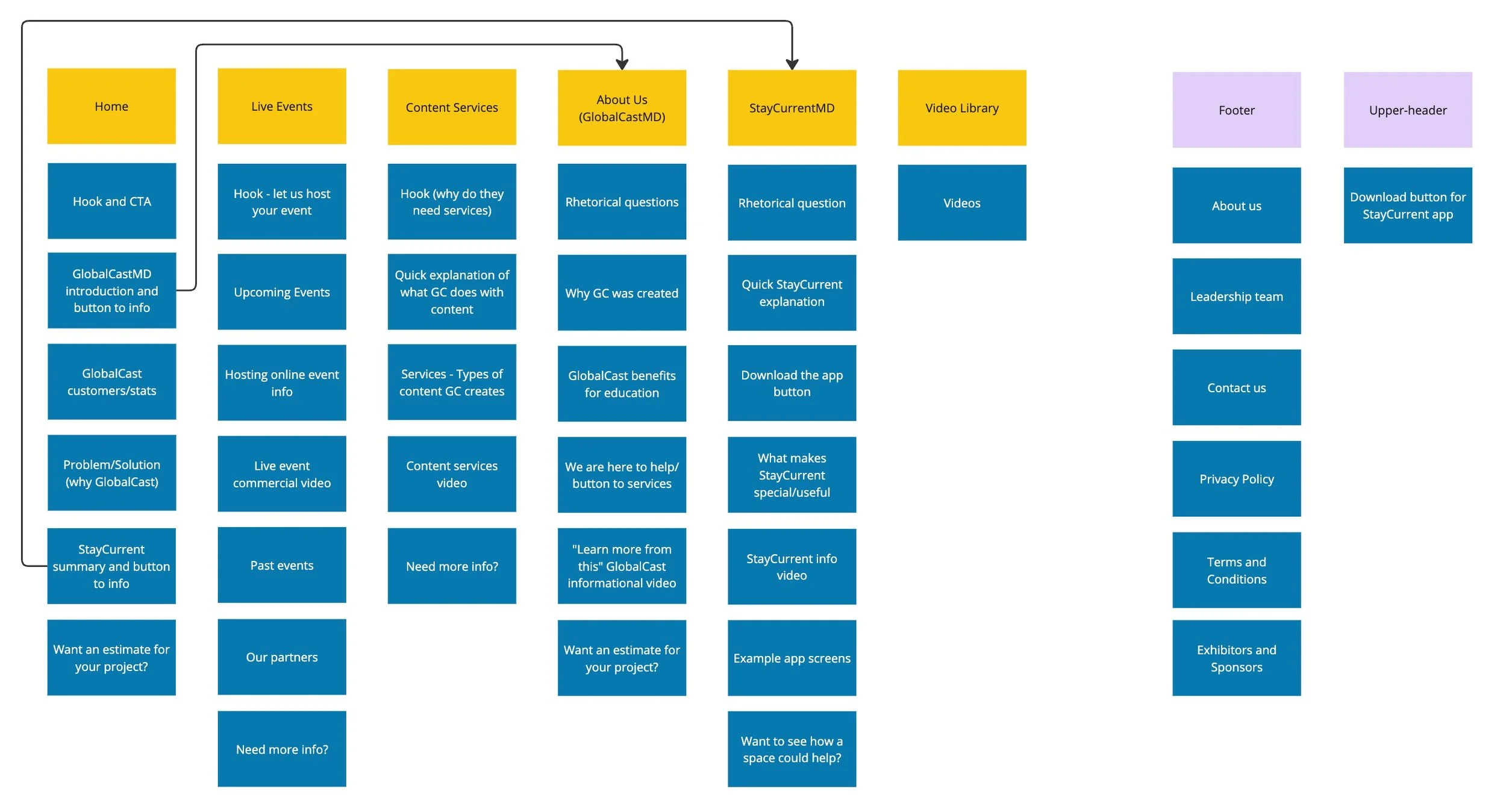
NEW IA
Rethinking the Old Website
The original GlobalCastMD website had good info, but it wasn’t presented in a clear or intuitive way. There was also misaligned text, broken links, and nonfunctional buttons. I knew that we needed to make some changes to the structure of the content as well as the design aspects. Here’s a look at the parts of the original pages.

Redesign Sketches
First round of low-fidelity sketches. The designs ended up shifting by the final design, but here are my initial thoughts about how the new website should look.

High-Fidelity Wireframes
After countless iterations of wireframes and many meetings with stakeholders, here are the final website designs that were chosen for the new GlobalCastMD website.


Testing (Ongoing)
Testing is still in progress. As of Summer 2025, I have built out the designs in Wordpress with assistance from another designer. Once the website is approved for publishing, we will re-test the new designs and make changes as needed.
Key Takeaways + Improvements
As testing is still in progress, I won’t have a complete list of results until the project is finalized. But for now, here’s what I’ve learned and what’s been improved!
The main concern with the original website was the lack of clarity about (1) what GlobalCast does and (2) what is StayCurrent (their app). My updated designs clearly laid out answers to these questions from the first page. I feel that the project was a success simply from completing this goal!
Each web page has been decluttered. Any unnecessary information has been removed and each body of text was carefully written and chosen by GlobalCastMD leaders. I really pushed to limit paragraphs and to more concisely explain each topic.
The website now has a clean and modern look. The old pages felt overwhelming to users with over-sized images and too many rhetorical questions with too view answers. The new design focuses on simplicity in the best way. We get straight to the commonly asked questions without overwhelming graphics or videos.
Personally, I learned so much from this project. This was my first UX project where I was hired by the company to redo the website on my own, with free reign to follow whatever design process I wanted. I loved getting to make a project plan and see it succeed how it did. From user testing, to industry research, prototypes, and finally high-fidelity mockups, I was able to implement design thinking concepts to create a great final product.
I had the best experience working with the GlobalCastMD team. Huge thanks to Ramy Shaaban for being a mentor and excellent designer to bounce ideas off of. Also thank you to Ajla Cengic and Kiersten Miller for providing me with feedback and content to use throughout the website.